Calligraphy for Beginners: How to Write Beautiful Letters from Scratch
Learn calligraphy from scratch with brush pens, the right paper, and a stroke-first practice method that actually builds lasting skill.
Calligraphy looks impossible from the outside. You see a finished piece with perfectly weighted letters, elegant swells and hairline strokes, and assume the person who made it has some innate artistic gift you don't. Most beginners assume this. The reality is far more practical. Calligraphy is a physical skill, not an artistic talent, and physical skills are learned through repetition. The weighted strokes come from pen angle and pressure, not from a naturally steady hand. The letterforms are learned, not invented. Anyone who can hold a pen and commit to thirty minutes of daily practice will be producing recognizable calligraphic letters within two weeks of starting.
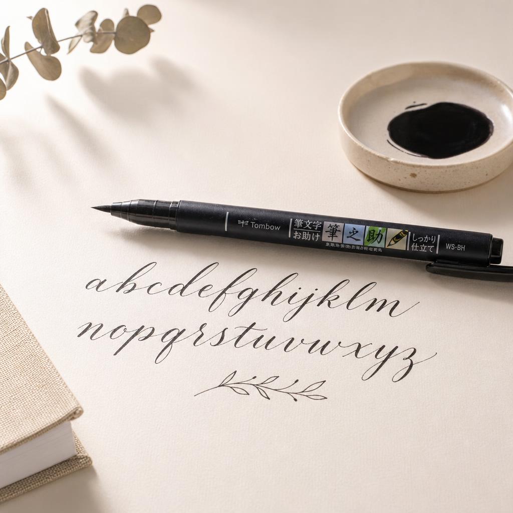
Out of the three main entry points for beginners — pointed pen calligraphy using a classic dip pen with a flexible metal nib, brush pen calligraphy using specially designed felt-tip brush pens, and broad-edge calligraphy using a flat nib that creates thick and thin strokes through angle alone — brush pen calligraphy is the most forgiving starting point. The pens are self-contained, so there's no ink bottle to knock over and no nib to clean after every session. The brushes are also durable enough to survive the slightly wrong pressure that beginners apply constantly. Tombow dual brush pens and Pentel Touch Sign pens are the most widely recommended starter tools, and they cost about the same as a decent ballpoint pen.
Everything in calligraphy is built from two strokes: the shade stroke, which is thick and made on the downstroke with full pressure, and the hairline stroke, which is thin and made on the upstroke with almost no pressure. That's really the whole foundation. Every letterform is a combination of thick downstrokes and thin upstrokes joined together. The reason calligraphy looks so different from regular handwriting isn't really the letterforms themselves — since the alphabet is the same — but this consistent thick-thin contrast. A beginner's first job is to drill these two strokes separately until the pressure change between them becomes automatic. Most beginner guides skip this entirely and jump straight to letters. It's exactly why so many people plateau early and blame their handwriting rather than the process.
The most effective practice method is working from a guide sheet — a printable template with slanted guidelines at the correct angle, usually between 52 and 55 degrees, and lines marking the x-height, the ascender zone for tall letters like h, l, and b, and the descender zone for letters that drop below the baseline like g, p, and y. Printing one and slipping it under smooth marker paper gives you structure without constraint. Spend your first week on basic strokes only: downstrokes, upstrokes, ovals, and compound curves. Week two is lowercase letterforms. Week three, connect letters into short words. Most beginners are writing legible calligraphic sentences by the end of week three.
Three mistakes derail most beginners. The first is holding the pen too tightly — the pen needs to glide, not be gripped, and a tense hand produces stiff, choppy strokes with no flow. The second is moving only the fingers and wrist rather than letting the whole arm guide long strokes from the shoulder. The third is practicing at random rather than drilling weak letters deliberately. Ink bleed on upstrokes is another common frustration caused by using standard printer paper, which absorbs ink too fast. Switching to Rhodia, Clairefontaine, or smooth HP Premium 32 paper usually fixes this immediately. If hairline upstrokes look thick and scratchy, the issue is almost always pressure — genuinely almost no pressure is needed on the upstroke.
Once the modern brush calligraphy alphabet feels comfortable, the natural next step is pointed pen work using a Nikko G or Zebra G nib in a pen holder with bottled ink. Pointed pen produces finer hairlines and a more traditional look, but it asks more from you in terms of ink flow management and nib cleaning habits. Beyond tools, style exploration opens up quickly: gothic blackletter for dramatic visual impact, italic calligraphy for a cleaner contemporary feel, or Copperplate for the highly structured classical style that was the dominant handwriting standard for two centuries. Most calligraphers eventually develop a signature style that borrows elements from several traditions. That's the point where it stops feeling like practice and starts feeling like yours.
Materials You'll Need
- Tombow Fudenosuke hard tip brush pen
- HP Premium 32 or smooth marker paper
- Printed calligraphy guide sheet (free printable)
- Calligraphy alphabet reference worksheet
Step-by-Step
Gather the Right Materials
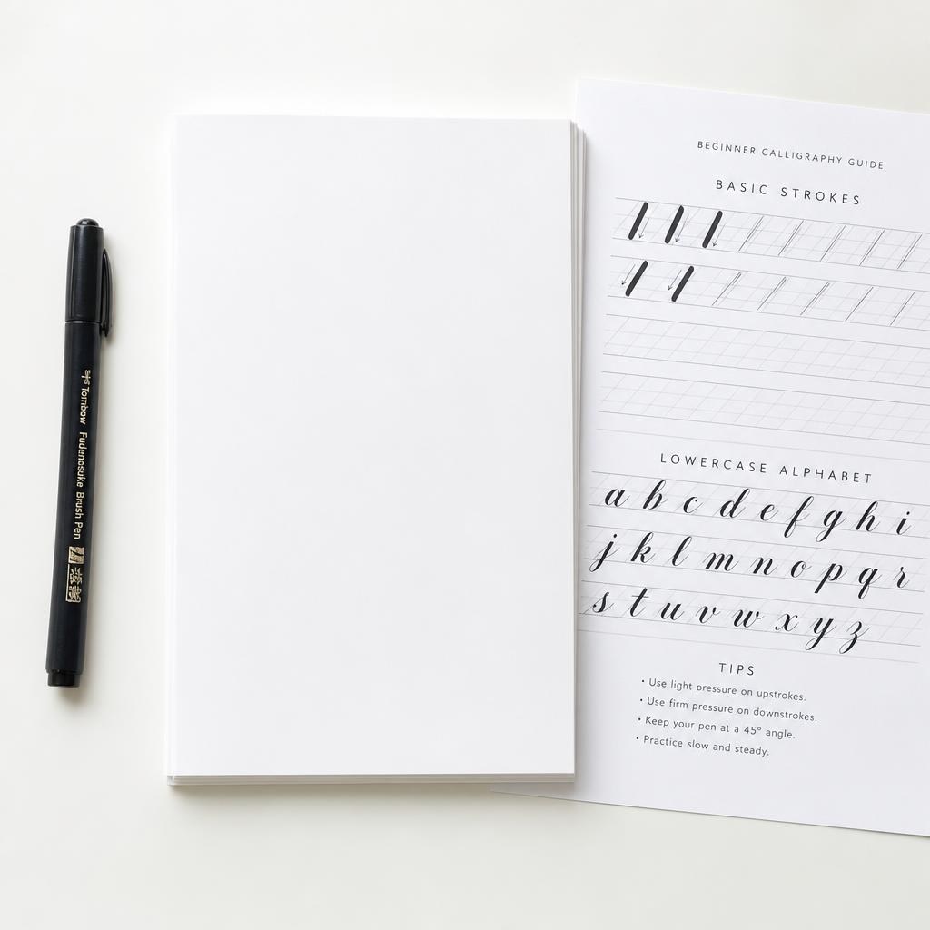
You need exactly three things to start: a brush pen, smooth paper, and a guide sheet. For the brush pen, the Tombow Fudenosuke hard tip is the best beginner choice because the hard tip is more controlled than the soft tip and far less prone to splaying before your pressure technique develops. Resist buying a full calligraphy starter kit from a craft chain. They typically bundle dip pens, multiple inks, and several nibs that will overwhelm you before you have any fundamentals in place. One good brush pen handles everything you need for the first month. Paper matters more than most beginners expect. Standard printer paper has a rough surface at the microscopic level that drags on brush fibers and causes ink to feather at the edges of every stroke. Pick up a pad of HP Premium 32 paper or smooth marker paper — both are inexpensive and transform the writing experience almost immediately. Print a free practice guide sheet (search 'modern calligraphy guide sheet printable' and dozens of free options appear), then slip it under your writing paper to use as a light guide through the sheet. Work at a desk rather than your lap, with the paper tilted slightly toward your dominant hand at a comfortable angle.
Drill the Two Core Strokes First
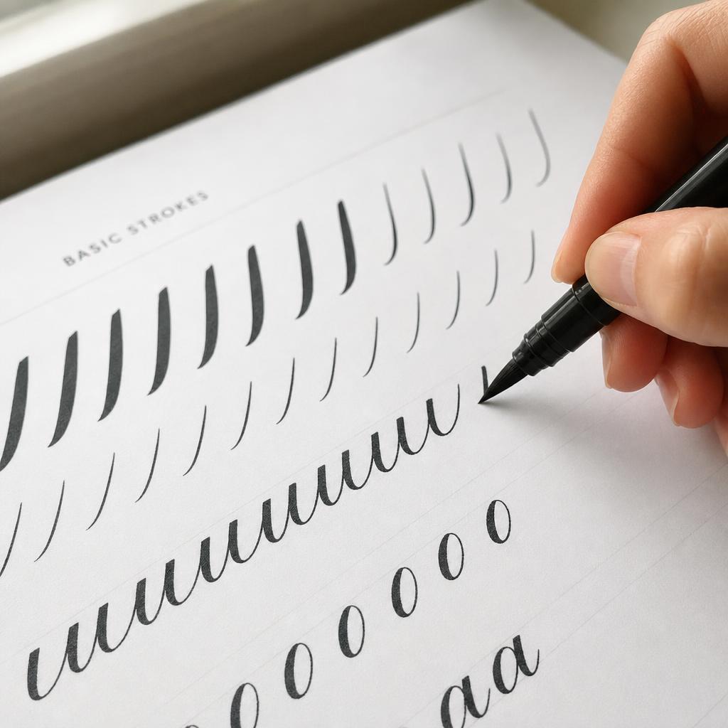
Before writing a single letter, spend at least two full practice sessions on basic strokes only. The downstroke: start at the top guide line, press the brush firmly so the full side of the tip makes contact with the paper, and pull smoothly downward to the baseline. The stroke should be thick, even, and consistent in width from top to bottom. The upstroke: start at the baseline, use almost no pressure so only the very tip of the brush makes contact, and push lightly upward. It should be nearly a hairline. These two strokes are the grammar of calligraphy — everything else is vocabulary built from them. Practice strokes in deliberate rows. Row one is all downstrokes across the full page. Row two is all upstrokes. Row three alternates down and up in a connected bouncing oval shape that most teachers call the undulation stroke. When this rhythm feels natural — when the pressure shift between thick and thin happens without deliberate thought — you're ready for letters. For most people this takes two to four sessions. Rushing past this stage to jump into letterforms before the pressure change is instinctive is the single most reliable way to stall your progress for weeks.
Learn Lowercase Letters in Stroke Groups
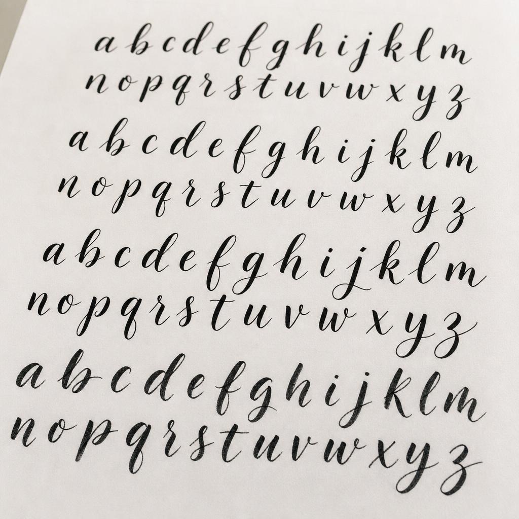
Modern calligraphy lowercase letters fall into natural groups based on the strokes they share. Start with the oval family: a, c, d, e, g, o, and q all begin with a curved oval motion. Next tackle the simple downstroke letters: i, t, u, and w. Then the compound curve family: m, n, v, x, y, and z. Finally work on letters with ascenders — the tall ones like b, f, h, k, and l — and letters with descenders that drop below the baseline, specifically g, j, p, q, and y. Grouping them this way means every new letter is mostly a stroke arrangement you already know. Write each letter slowly. Calligraphy has no reward for speed, and rushing is what produces the uncontrolled pressure spikes that make strokes look lumpy. Before putting pen to paper, trace the letter with your finger to build muscle memory of the shape before adding pressure mechanics on top. Use a reference calligraphy alphabet worksheet for the correct stroke order. Unlike print or cursive, stroke order in calligraphy is optimized for pressure flow rather than visual logic — which surprises most people. When a letter consistently looks wrong, identify which specific stroke is off rather than rewriting the whole letter repeatedly.
Connect Letters Into Words
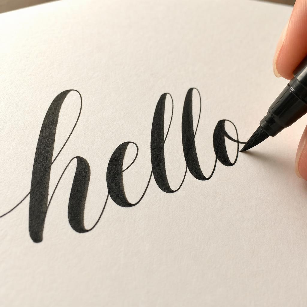
Connecting letters in brush calligraphy is done with exit strokes — thin upward curves at the end of each letter that flow into the start of the next one. In modern calligraphy these connections are loose and stylized rather than rigid, and this looseness is exactly what gives the style its flowing, personal quality. The challenge beginners face is keeping exit strokes thin. There's a natural tendency to press slightly harder during transitions, which turns what should be a hairline connector into a thick stroke and muddies the word visually. Start by connecting just two letters at a time rather than attempting full words immediately. Write 'an', then 'am', then 'in', then 'on'. Short pairs let you focus entirely on the exit-entry transition without also managing the overall word shape. Once two-letter connections feel clean and consistent, move to three letters, then to short familiar words. Writing your own name repeatedly is unexpectedly effective at this stage — because you know the word shape so well, you can direct all your attention to stroke quality rather than letterform recall. By the time a short word flows comfortably, you've essentially internalized the entire connection system.
Written by
Sarah Mitchell
Fiber Arts & Macramé Expert
Sarah has been knotting, weaving, and stitching for over a decade. Her work blends traditional fiber techniques with modern minimalist aesthetics.